Your landing page form can make or break your lead capture efforts.
In fact, poorly designed forms often result in reduced conversion rates, increased acquisition costs, and ultimately, low-quality leads that leave clients and sales teams dissatisfied.
In this post, I’m dropping some landing page form teardowns, showcasing the best, the worst, and the downright disastrous.
I’ll reveal the common pitfalls that can sabotage your conversion rates and provide you with proven examples of high-performing forms to implement on your own landing pages.
With these insights, you’ll have everything you need to skyrocket your landing page conversion rates.
Ready? Let’s go!
5 Worst landing page forms (and mistakes to avoid)
Let’s kick things off by exploring the pitfalls of subpar landing page forms, progressively moving from unfavorable to downright disastrous.
1. The Elusive Form: Tucked Away at the Bottom of the Page, Compelling Visitors to Scroll to Find it
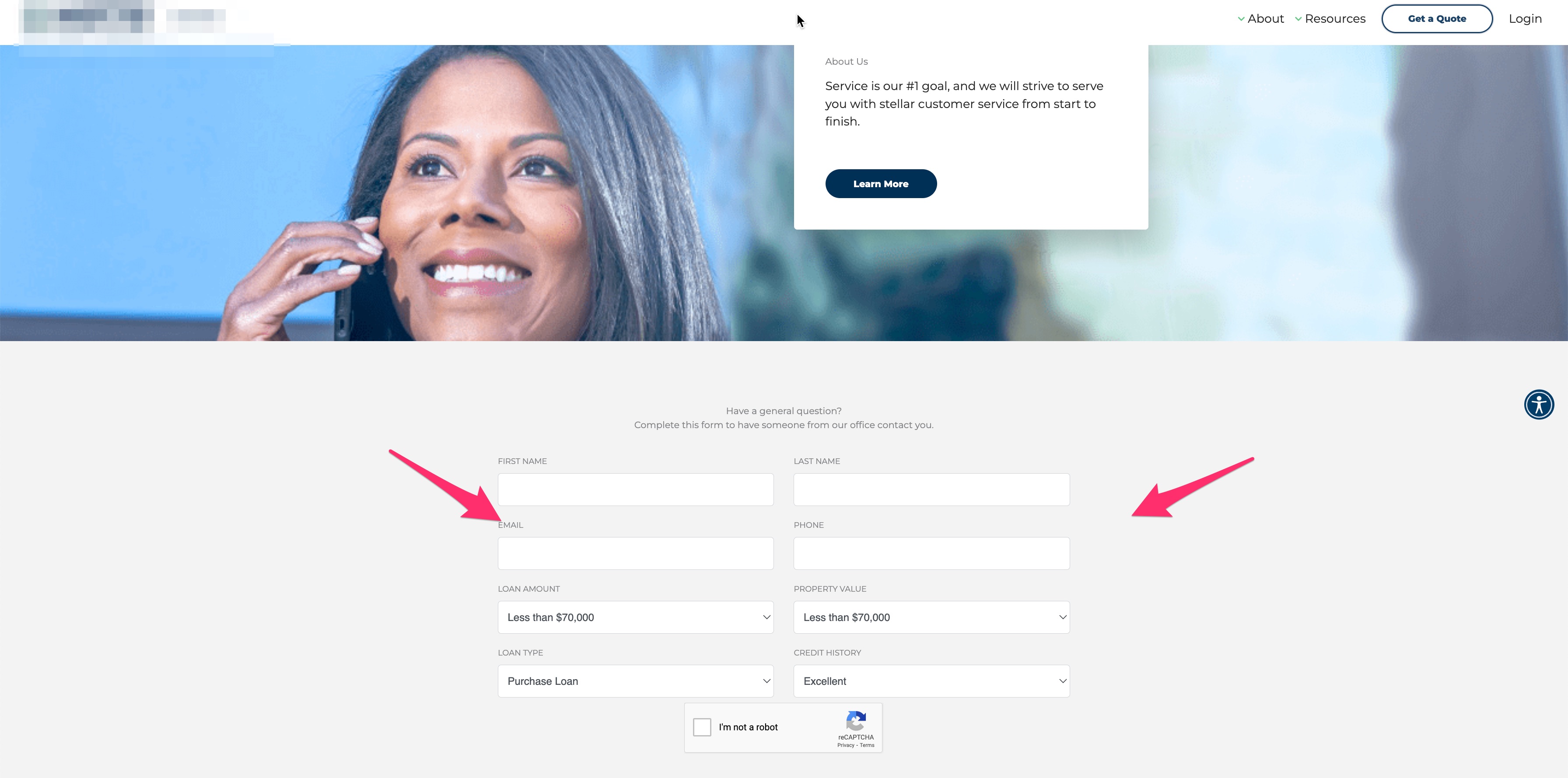
Upon examining this form, you might initially think:
“Is it really that bad?”
At a glance, this landing page form has a few positive aspects.
It boasts a modern UI and includes a couple of qualifying questions within the form itself – well done!
However, two significant issues are hard to overlook.
Issue #1: Concealed Submit Button
Do you notice a submit button anywhere on this form?
Neither do I.
This glaring omission poses a significant problem when it comes to conversions.
At first glance, the only element resembling a button is the Google reCAPTCHA.
In fact, the ‘Get a Quote’ button only appeared after selecting the ‘I’m not a robot’ checkbox.
This implementation creates an unfamiliar and perplexing user experience when interacting with forms. While this may seem like a minor issue, it introduces confusion to the process of filling out the form, resulting in disorientation.
Any confusion added to a conversion experience is likely to cause a drop in conversions, according to our friends at Wider Funnel.
Issue #2: Form Placement
The second major problem with this form is its location on the page.
To access the form, the prospect must scroll to the very bottom of the page.
This placement is problematic because after analyzing scroll patterns using Hotjar, I’ve noticed that on average, about 80-90% of visitors do not make it to the bottom of the page — which is exactly why this is one of the worst places to put your form.
There are two potential solutions
The more straightforward solution – relocate the form higher up on the page, preferably above the fold.
Secondly, enhance the form’s accessibility by deploying a feature known as the onsite message, available at GetLeadForms.
The onsite message is a small, persistent message displayed to the user regardless of their position on the page.
This ensures your form never goes unnoticed.
When clicked, the lead form opens directly on the page.
Explore this demo for a closer look.
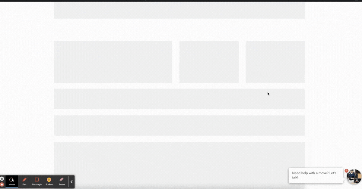
2. The Overwhelming Form: A Cluster of Fields that Induces Anxiety
I don’t know about you, but this second form instantly triggers anxiety with its cluttered array of tightly-packed fields. That’s why it earns the honor of being the second-worst landing page form on my list.
Surprisingly, this demo form belongs to a multi-billion-dollar software company you’ve likely heard of. You’d expect them to invest some effort in optimizing their form to be more visually appealing.
Here’s a rundown of the immediate issues I’ve noticed:
- Fields are compressed, creating the impression that there are more questions than there actually are.
- The field label font is excessively large and difficult to read, particularly when considering the limited spacing between fields.
- There’s an abundance of awkward spacing between field labels and the fields themselves.
- The labels also appear twice on the form—once to the left of the field and again inside the field.
- Every field is marked as required, but the accompanying symbols are redundant and contribute to cognitive overload, tempting users to click the back button.
- The form requests personal information first. Our testing at GetLeadForms indicates that it’s more effective to begin with simple questions and gradually progress to more complex inquiries. Like in this example.
- Lastly, the submit button lacks a distinct and persuasive call-to-action.
It’s safe to say that this form is adversely affecting the landing page’s conversion rate and some simple changes could go a very long way.
3. The Distracting Landing Page Form: Floating in a Whirlpool of Yellow and Red
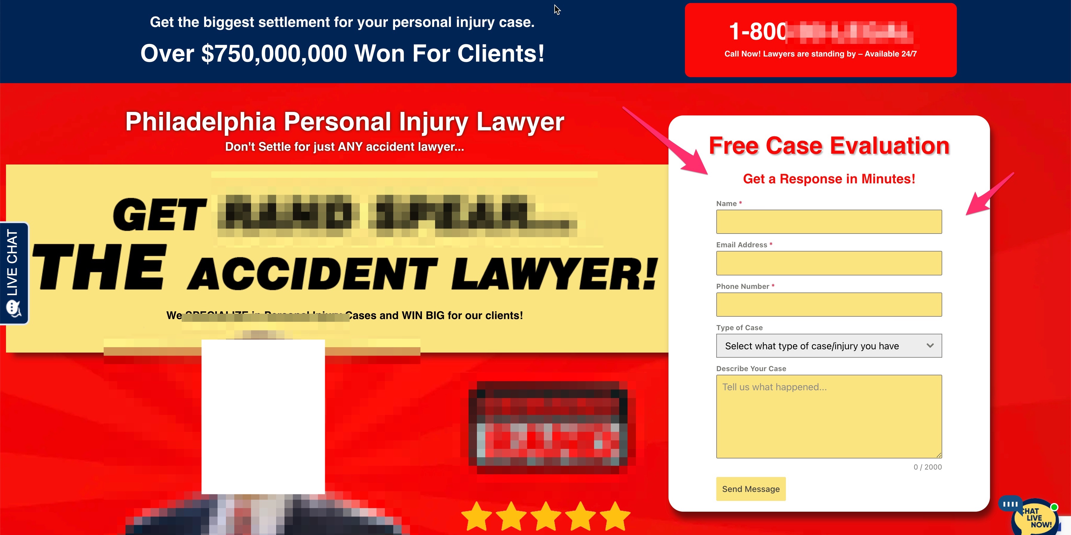
I have to admit, this landing page makes me think of the circus, with all of that red and yellow.
Now, let’s focus on the issues present in this landing page form:
Issues:
- The page’s overwhelming colors clash with the form input fields, creating an intense cognitive overload and disorientation.
- The ‘Send Message’ CTA is bland and lacks persuasive power.
Despite these issues, there are a couple of aspects done right:
- Clear and focused copy: The form’s headlines, “Free Case Evaluation” and “Get a Response in Minutes!” are incredibly straightforward.
- Qualifying case dropdown: The form effectively qualifies prospects based on their desired case type.
So, how can this landing page form be improved?
First, I’d replace the glaring red background with a subtle color that evokes trust.
Next, I’d transition to a multi-step lead form like this:
The power of this form lies in its personal, engaging nature, setting it apart from the current form in this example. You can view this template here.
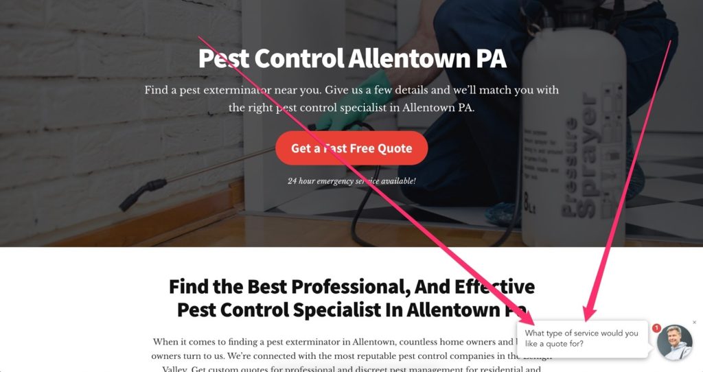
4. The Neglected Local Service Form: Pushed to the Sidebar as an Afterthought
In our next example of a poorly designed landing page form, we’re looking at an HVAC and Plumbing company. This example is particularly relevant because the issues identified are common among service-based businesses.
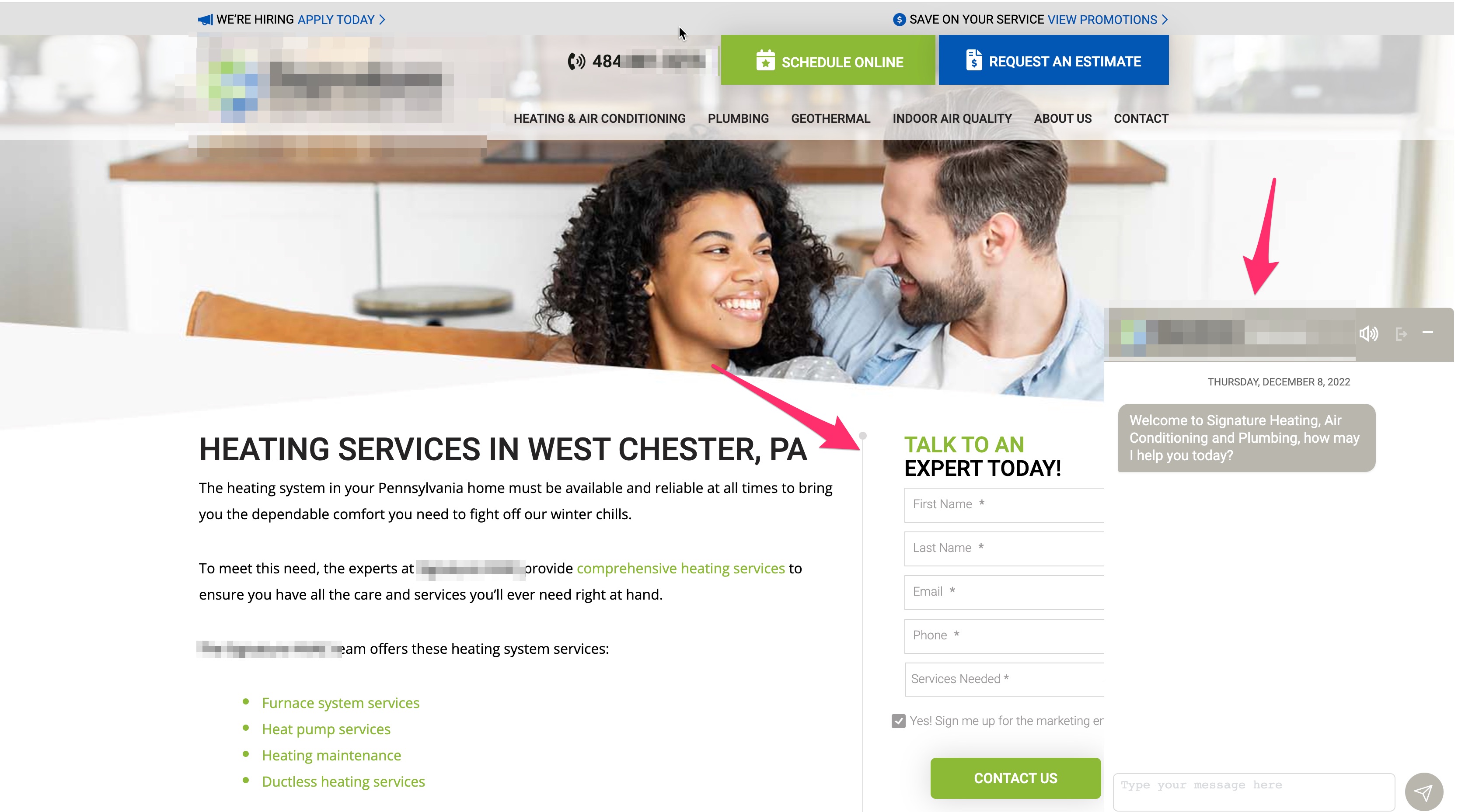
Let’s dig into the issues:
- Competing forms: The most significant issue is that this landing page form competes for the prospect’s limited attention with a chatbot. As soon as I landed on the page, a chatbot popped open right over the form, creating a confusing and disorienting experience.
- Layout: Another problem is that the form is tucked away on the right side of the page, blending in with similar content. Due to its placement, the form gets pushed to the bottom of the page on mobile devices, likely negatively impacting mobile conversion rates.
- Lackluster copy: Lastly, the copy of this landing page form leaves room for improvement. While the CTA, ‘Talk to an Expert’ may be persuasive for a B2B service business, it falls flat for a plumbing and HVAC company. A more compelling CTA could be ‘Get a Fast, Free Quote’ or ‘Request an Estimate’. Remember to align your CTA with your target audience and offer.
5. The Outdated Landing Page Form: Trapped in the 2005 Time Warp
Drumroll, please 🥁
Our top contender for the worst landing page form belongs to this business seeking to generate debt consolidation quotes.
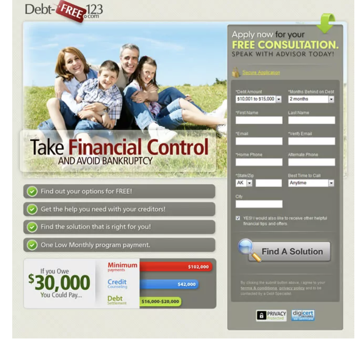
Let’s examine the issues that make this landing page form one of the worst on our list.
Outdated appearance:
If we were in 2005, this landing page form might be considered pretty impressive. However, at the time of writing, it’s more than 8 years later, and form design has evolved significantly over the years.
The best lead generation forms no longer resemble this dated design. Instead, they are interactive and crafted for a user-friendly experience. Like this example.
Spam-like appearance:
Another significant issue with this form is its spam-like appearance, reminiscent of early 2000s lead capture forms. Multiple aspects of this form appear spammy, from the bright green letters and bold arrows to the three different security badge icons incorporated into the form.
Excessive fields:
Last but not least, the form contains an overwhelming number of fields, all tightly packed together, which can deter potential leads from engaging with it. At GetLeadForms, we recommend engaging your prospect with one question at a time.
Best Landing Page Forms
After examining the worst landing page forms and identifying the mistakes to avoid, let’s now turn our focus to some of the best examples of landing page forms on our list.
1) HomeAdvisor’s Streamlined Multi-Step Form and Minimalist Landing Pages
HomeAdvisor’s landing page forms are sleek and easy to use.
That’s probably why HomeAdvisor has been using the same form style for years with great success.
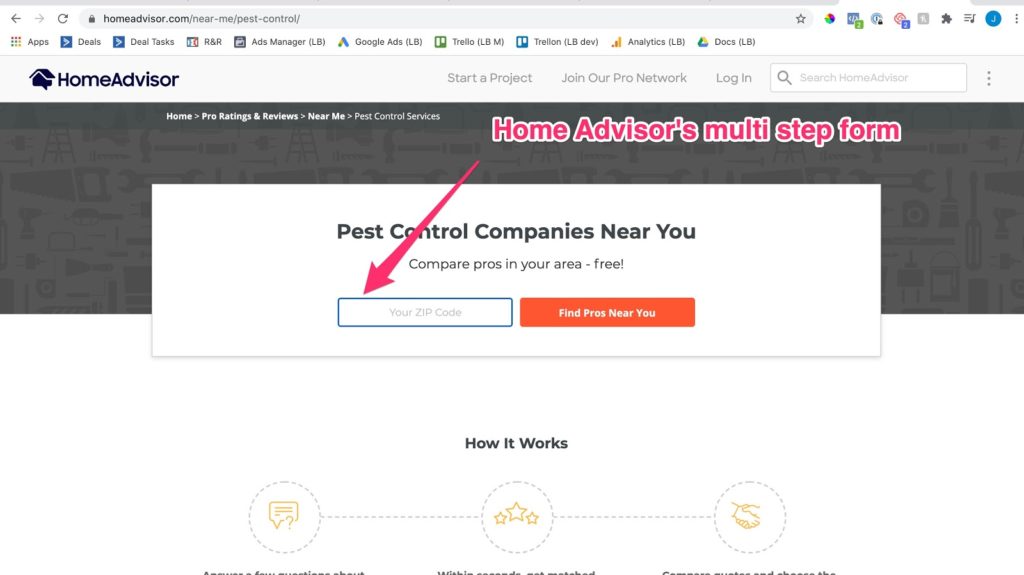
What I like about HomeAdvisor:
- Their forms are divided into multiple steps, making it easy for prospects to provide the necessary information that HomeAdvisor needs to capture from the lead.
- HomeAdvisor eliminates all distractions on the page. They genuinely embrace the KISS principle by featuring just a headline and a form.
- They use smart, conditional logic that adjusts responses in the forms based on the prospect’s selections.
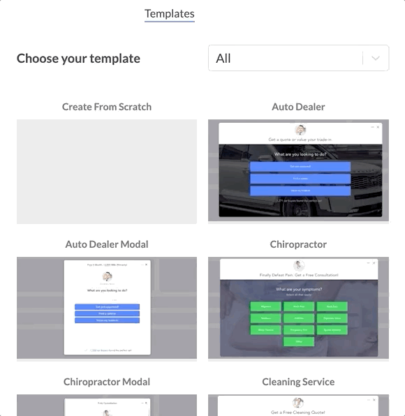
You can’t go wrong with emulating HomeAdvisor’s multi-step forms. If you’re interested in creating a form like this, then I recommend checking out our HomeAdvisor-inspired templates at GetLeadForms.com.
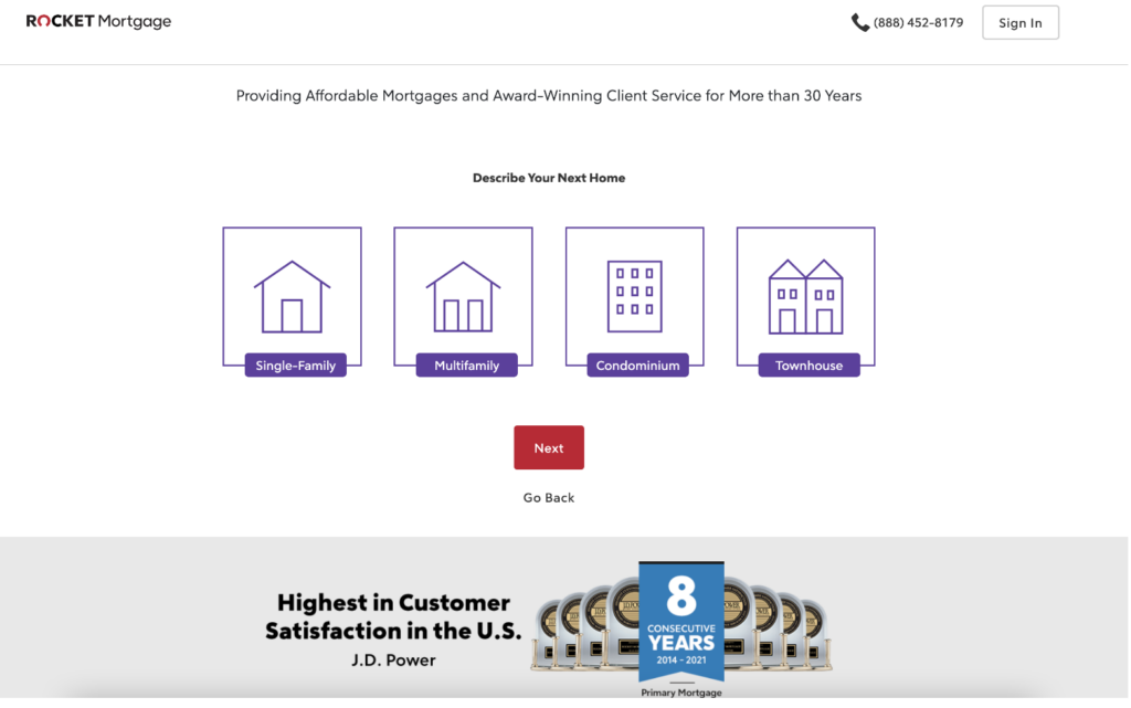
2. Rocket Mortgage’s Engaging Form that Effectively Qualifies Mortgage Leads
Rocket Mortgage earns a spot on our list of best landing page forms with their impressive approach.
Similar to HomeAdvisor, Rocket Mortgage initiates its form with a straightforward question, as shown here:
Are you noticing the pattern?
Industry leaders are leveraging multi-step forms.
Here are some aspects of Rocket Mortgage’s form that stand out:
- The use of prominent icons in the buttons enhances the user experience, making the form more visually engaging.
- The multi-step structure allows prospects to follow different paths based on the type of home they’re seeking. This strategy is highly effective, especially for lenders aiming to craft high-converting mortgage forms.
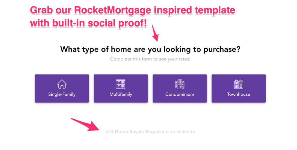
Interested in creating a form similar to the Rocket Mortgage example that I shared above? Check out our Rocket Mortgage-inspired template here:
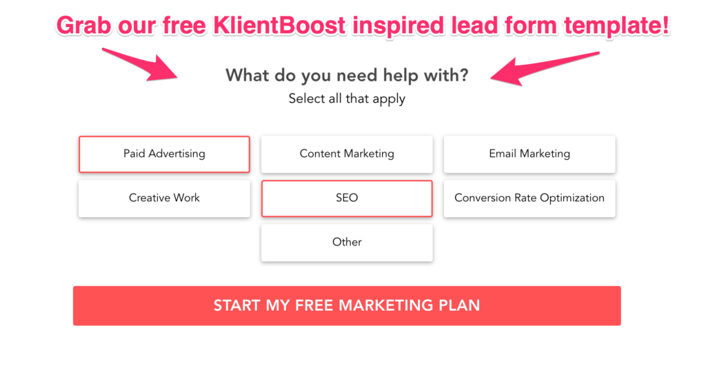
3. Klientboost’s Ingenious Multi-Step Form Leveraging the Breadcrumb Technique
Klientboost is a name that’s likely familiar to marketers in the agency world.
For those of you who haven’t come across them, Klientboost is a performance marketing agency that excels in helping clients generate more leads.
Among their many marketing strengths is their expertise in form design and conversion rate optimization.
For instance, instead of asking their prospects for their personal details in a bland, boring form. Klientboost starts the process by simply asking the prospect what they need help with.
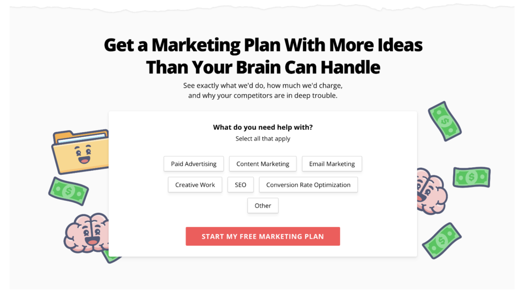
After the prospect responds to the first question, they are then asked a series of questions to help qualify the lead.
Here’s what makes this form truly exceptional:
- The landing page boasts an inviting and straightforward design. Upon arrival, your attention is immediately drawn to the offer and then to the form.
- Klientboost cleverly starts the form with a low-friction question: “What do you need help with?” This approach not only aids in qualification and segmentation but also engages the prospect before requesting higher-value information. Klientboost refers to this as the breadcrumb technique (link).
- In the second step, Klientboost inquires about the prospect’s goals. This primes the customer to consider their desired outcomes, likely making it easier for them to share their contact details.
Get your own Klientboost-inspired form template here.
4. The Clever Multi-Step Pest Control Form: Attracting Prospects With a Personal Look and Feel
Our final form example comes from a lead generation site that I built back when I was in the business of buying and selling leads.
A standout feature of this example is the use of our high-converting chat-style form, meticulously designed to create a more personal and engaging experience.
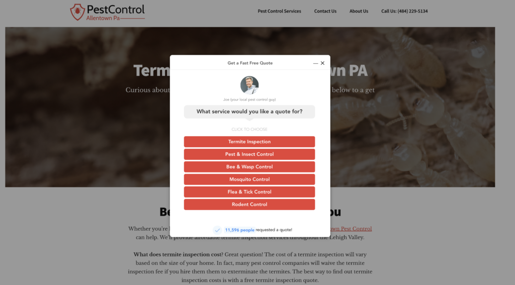
Grab your own copy of this template here.
Here’s what stands out about this lead form:
- The image of someone who is actually from the business. In a world where people are increasingly cautious about submitting forms, any element that fosters trust is invaluable.
- In addition to trust-building, this LeadForm incorporates real-time social proof to further enhance conversion rates.
- Lastly, this is a multi-step form, reminiscent of the HomeAdvisor and RocketMortgage examples, but with an added touch of uniqueness and user-centric design.
Wrapping it up: What makes a good landing page form?
Let’s wrap up by tying this all together with some final thoughts on what makes a great landing page form.
- Prioritize User Experience (Create People-Friendly Forms): User experience is of paramount importance. In fact, 33% of consumers report that a subpar user experience has deterred them from making a purchase. To enhance the UX of your forms, ensure they are compatible across various devices and browsers.
- Implement Smart Form Logic: Advancements in technology have made it possible to build dynamic forms that adapt in real-time based on a prospect’s responses. Not only does this approach maintain the prospect’s engagement throughout the form completion process, but it also enables you to gather more qualified leads that can be effectively segmented within your CRM.
- Optimize the Number of Form Fields (Strike the Right Balance): Including too many fields can crush conversions, while too few fields may lack essential qualifying questions. The key is to find the right balance. I typically recommend incorporating 1-3 key qualifying questions in addition to the standard contact fields.
- Utilize Conversion Elements Within Your Forms: A successful landing page contains core conversion elements such as CTAs, USPs, and social proof. These elements can also enhance your forms. For instance, at GetLeadForms, we’ve devised a way to integrate real-time social proof directly into your LeadForm, as shown in the examples throughout this post.
- Ensure Your Forms are Easily Accessible: It may seem obvious, but many businesses inadvertently make their forms difficult to locate, burying them at the bottom of a page or on a separate “Contact Us” page. Forcing visitors to search for your form negatively impacts conversion rates. People want information quickly and effortlessly, especially when using mobile devices.
- Don’t Neglect Your Form Design: Your form deserves thoughtful attention. Marketers often dedicate substantial effort to perfecting the landing page’s copy, design, and flow, only to hastily use a generic form from a CRM or landing page builder. As the examples in this post illustrate, marketers who succeed are those who invest extra care in crafting their forms.
By incorporating these best practices, you’ll optimize your landing page forms for higher engagement, increased conversions, and more qualified leads.
And with that, we’ve reached the end of this post. The bottom line is clear: Don’t neglect your form.
We’ve gone through an array of examples, showcasing both the pitfalls and best practices of landing page forms. With the knowledge you’ve gained, you’re now equipped to optimize your own forms to get more (and better) leads.
The next step
It’s time to take action and put these insights into practice. Here are some valuable resources to help you get started:
Free trial of GetLeadForms: Want to create better forms but don’t know where to start? Grab a free trial of our lead form builder today, and begin crafting high-converting forms for your landing pages. Start your free trial.
Need some more inspiration? Explore these 14 Proven Lead Generation Form Templates, broken down by industry, to help you boost conversions and drive quality leads.
Need a starting point? Browse our full library of pre-built templates. Simply choose a template that resonates with you and customize it to suit your brand and objectives.