Decreasing form abandonment on your website is one of the best ways that you can increase conversion rates and generate more revenue for your business.
In this article, we’re going to show you how to lower form abandonment rates on your lead forms as quickly as today
Ready? Let’s go!
What is Form Abandonment and Why is it a Problem?
Form abandonment is when a user begins filling out a form, but does not complete it and never hits the submit button.
In other words, the lead is lost and it’s almost as if the prospect never began filling out the form in the first place.
If you already know that you have a problem with form Abandonment (or think you might), then I highly suggest testing LeadForms. You can grab a free trial here »
Otherwise, keep reading.
What causes form abandonment?
There are a number of reasons why someone may abandon your lead generation form.
- They got overwhelmed by too many questions (cognitive overload)
- The form asks too few questions, which sets red flags
- The form didn’t convey a sense of trust
- The form wasn’t optimized for the prospect’s device (i.e, not mobile optimized)
- Technical reasons like validation issues
- And so much more
How Can Decreasing Form Abandonment Get You More Leads?
Let’s take a look at some form abandonment statistics. According to a 2018 Baymard Institute statistic, form abandonment rates hover around 81.40%.
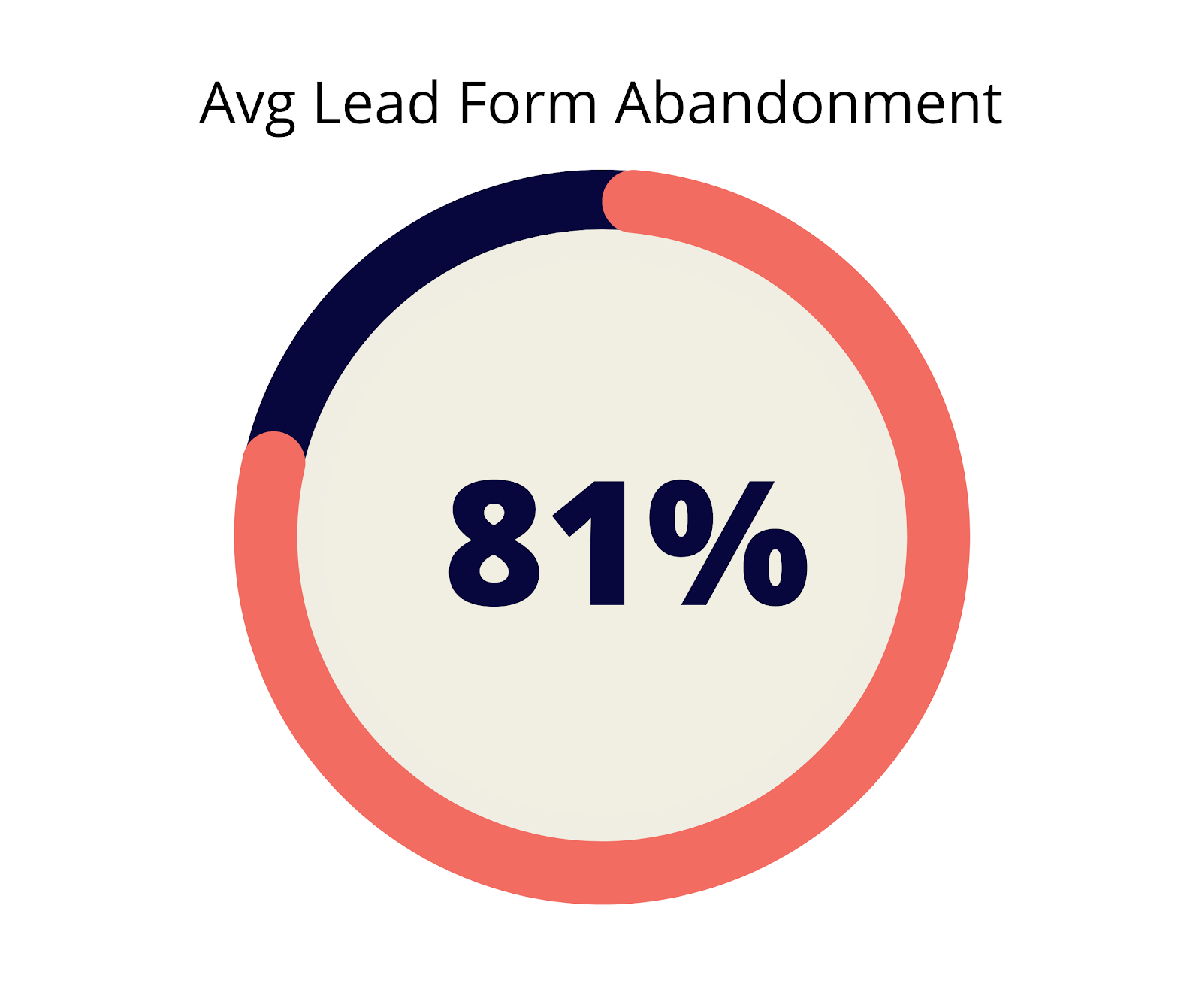
That means that for every 100 people who begin filling out your contact form, only 18 of them successfully click submit and turn into a lead.
That’s a ton of people who slip through the cracks. And even more marketing dollars that you’re flushing down the drain due to unoptimized forms.
Before we dive into the 11 simple steps that you can follow to decrease your form abandonment rates, let’s discuss which fields cause form abandonment in the first place.
Which Fields Cause Form Abandonment?
Before designing your form, take into consideration what fields are absolutely necessary.
When you have too much information required up front, or too personal of information, this could overwhelm and scare off potential customers that do business with someone else.
This is why at LeadForms, we always suggest starting out your form with a simple question to engage the prospect first – then start asking for more sensitive information later in the process, like in the bankruptcy form below.
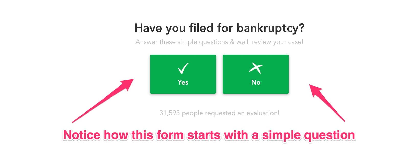
The above example was built with LeadForms. You can view an example here.
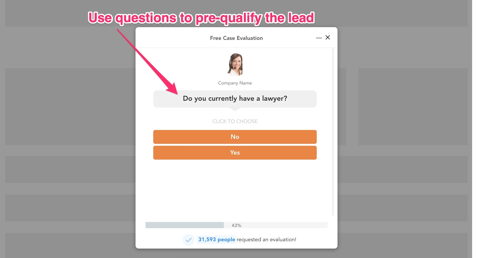
A key thing to keep in mind is that information can often be collected on the follow-up phone call or email, while other times that same information should be collected up front in the form to pre-qualify potential clients.
A great example of this would be a personal injury lawyer who wants to know if the prospect is already working with a lawyer. This is a simple question that should be collected in the form to not waste the attorney’s time with unqualified leads.
Fields that cause the highest form abandonment:
- Open-Ended Questions – Statistically speaking, open-ended questions that require a lot of information to be typed into it generally increase form abandonment rates and decrease conversions. The conversational forms we show you later in this article can shorten this down to simple click-of-a-button yes or no questions.
- Email & Phone Fields – Try to place those fields in the latter stages of your conversational forms after users have already invested their time into the pre-screening questions.
- Name Fields – One of the things that surprised us the most is that the name field typically has just as much friction as a phone number field. This is most likely because consumers have become more aware about things such as identity theft. One simple way to reduce friction when asking for the prospect’s name is to add a subtle message that says that you respect their privacy.
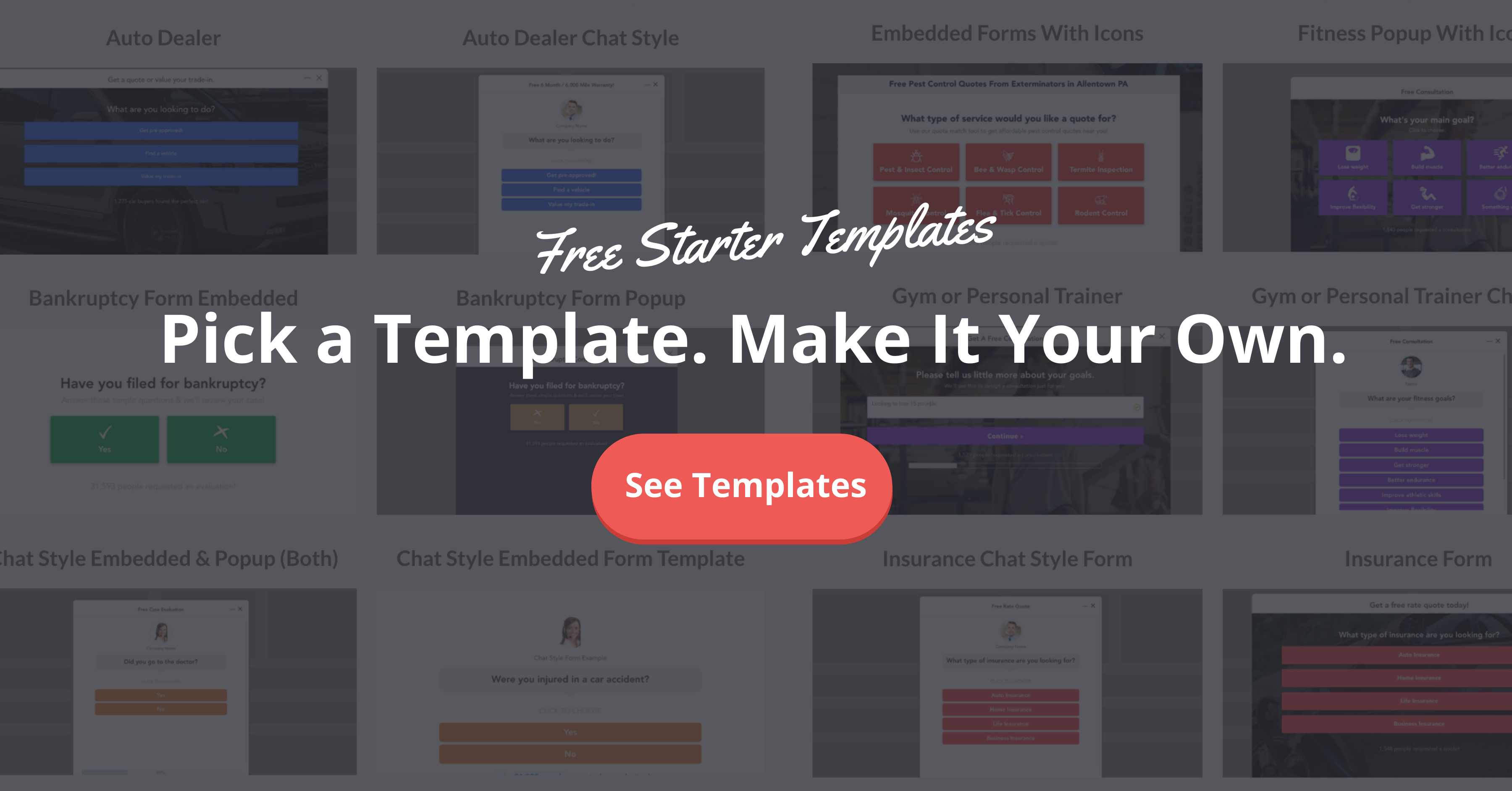
Now that we got some of the basics out of the way, let’s talk about 11 ways to decrease form abandonment.
11 Ways to Decrease Form Abandonment
Below are 11 strategies you can put to use immediately to reduce form abandonment and get more quality leads for your business.
1. Engage People with a Simple Question
The very first thing you want to do is to get the prospect started, because the momentum will pull them through the rest of the process.
In the following example of a lead generation form for a cleaning service, instead of a long complicated form that asks the prospect for all of their details in one shot, this user-friendly lead form hooks the prospect in with one simple question: “What type of service do you want a quote for?”
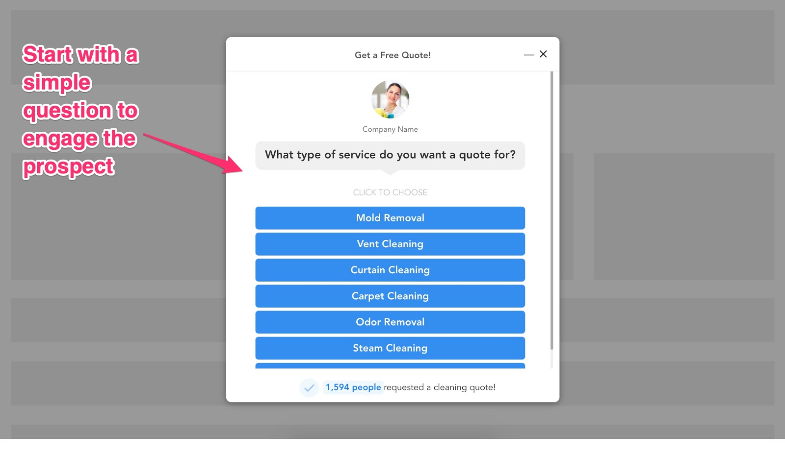
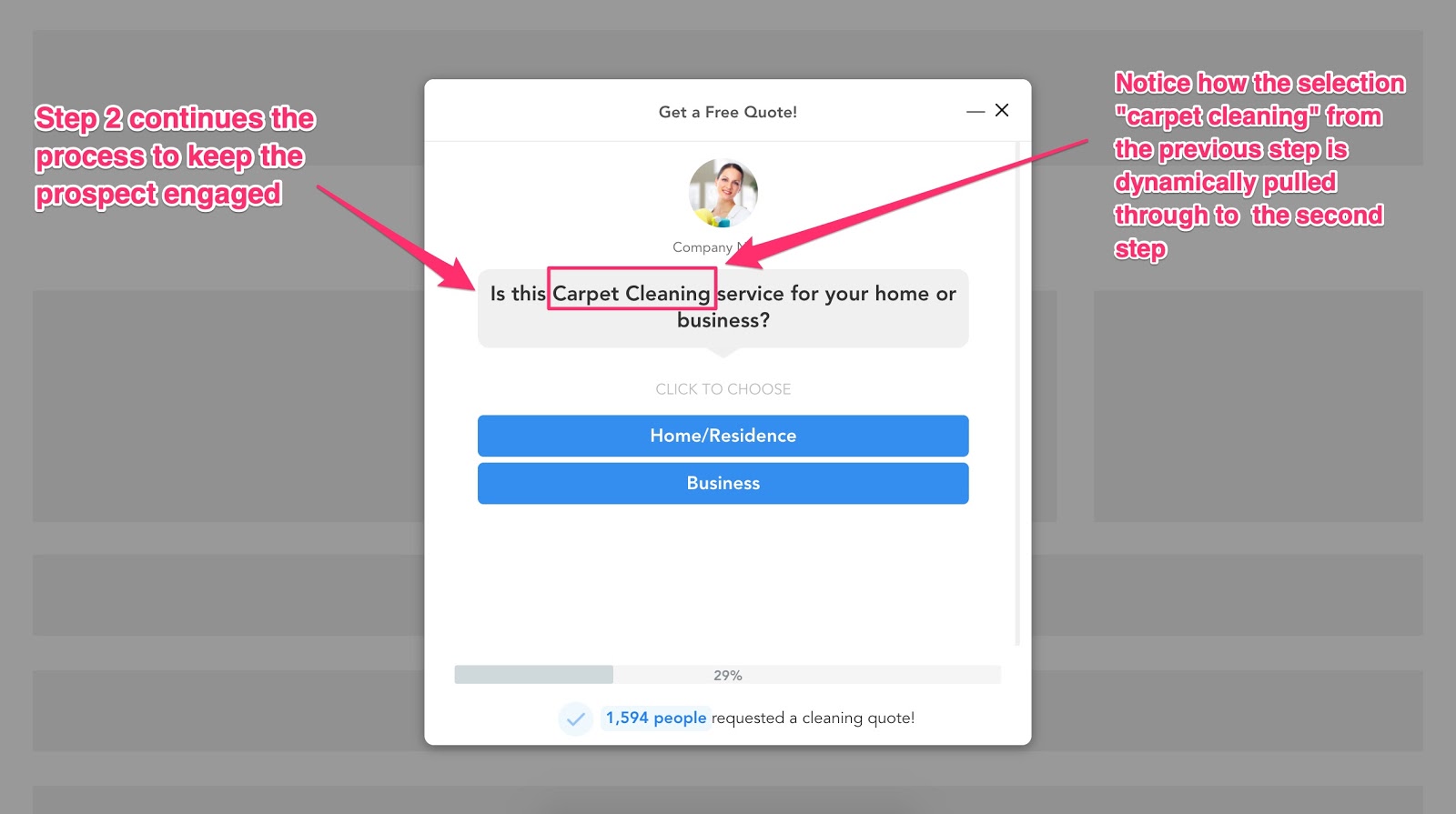
Let’s say that the prospect selects, “Carpet Cleaning” — the next question can ask for some additional information to pre-qualify the opportunity.
The above form is a unique interactive form that we developed at LeadForms. You can get this exact template here.
The reason why this works is because it reduces cognitive overload and gets the prospect committed to filling out the rest of your form.
What is one simple question that could make it seem almost like a fun quiz that people want to click and see what comes next?
You can see more examples like this and many others by browsing some of our latest form templates.
2. Reduce Form Abandonment By Breaking Your Forms Into Multiple Steps
What’s the one thing that the big guns know about lead form abandonment that most people don’t?
It’s that if you break your forms into multiple steps, then you’ll get more leads.
Yes… it’s really that easy.

Take HomeAdvisor as an example.
HomeAdvisor is one of the leading service providers that connects service businesses with qualified leads.
According to Spyfu, HomeAdvisor is crushing it when it comes to SEO and PPC with a Google Ads budget of +$4.5 million and ranking for over one million organic keywords.
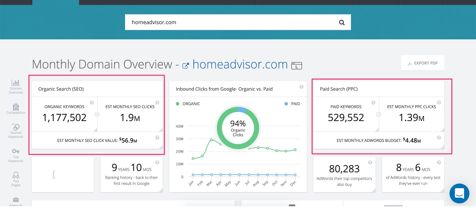
Just like how Amazon invests a ton of time and money into optimizing their ecommerce UX, HomeAdvisor has also invested a ton into optimizing their lead capture forms.
In fact, below is an example of a lead form from HomeAdvisor.
Notice how this form starts out with one simple question to get the prospect engaged — just like some of the examples that we already showed you in the beginning of this post:
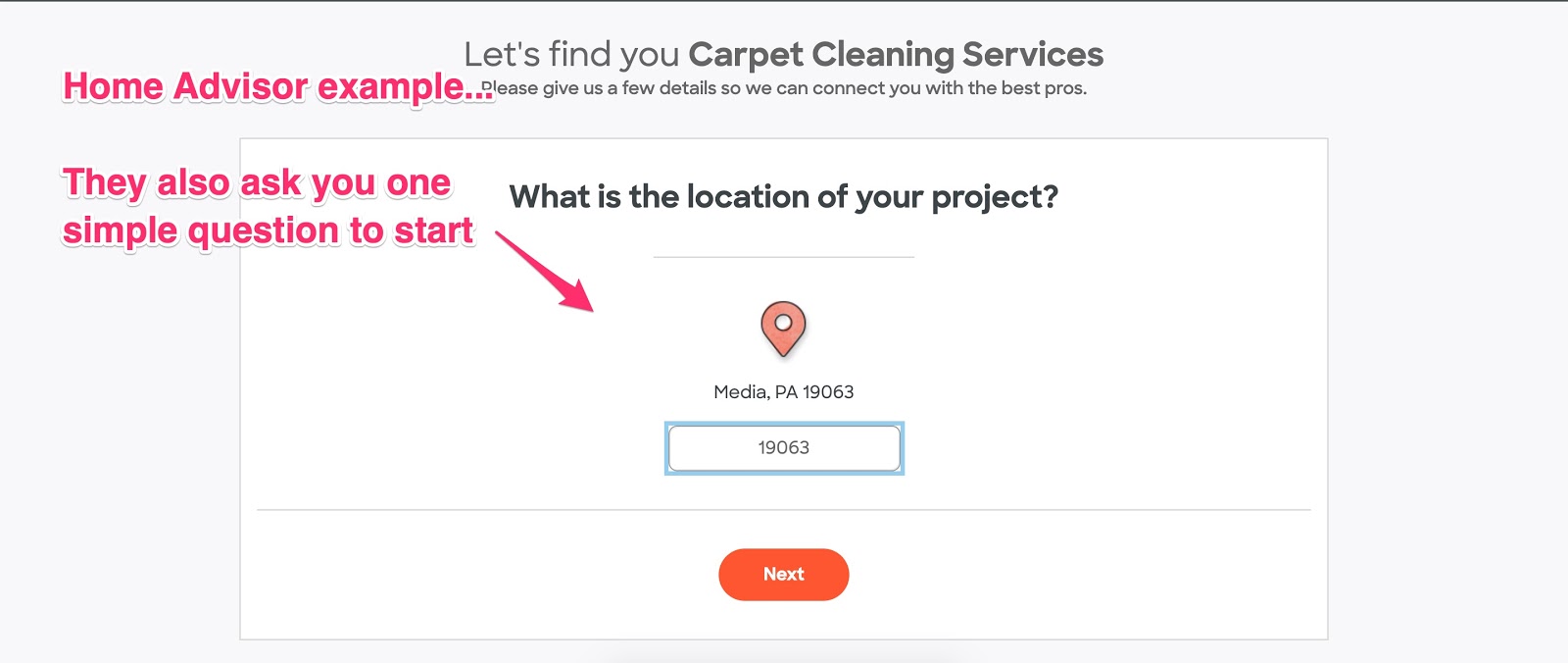
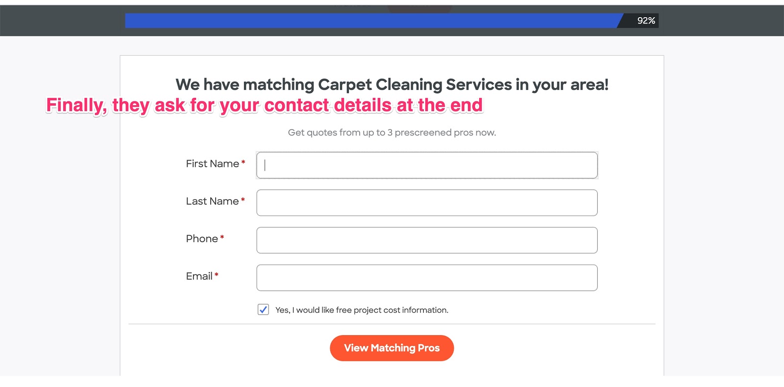
After you enter your Zip Code, HomeAdvisor starts asking for some additional information.
Then finally, HomeAdivsor asks for your contact information at the end of the form.
You can see more multi step form examples like HomeAdvisor here.
In the following example of a LeadForm, one of the screening questions for the personal injury attorney asks the prospect how much compensation they are looking for. This question not only primes the prospect to think about their desired outcome, but it also lives on its own step, so it doesn’t potentially overwhelm the prospect.
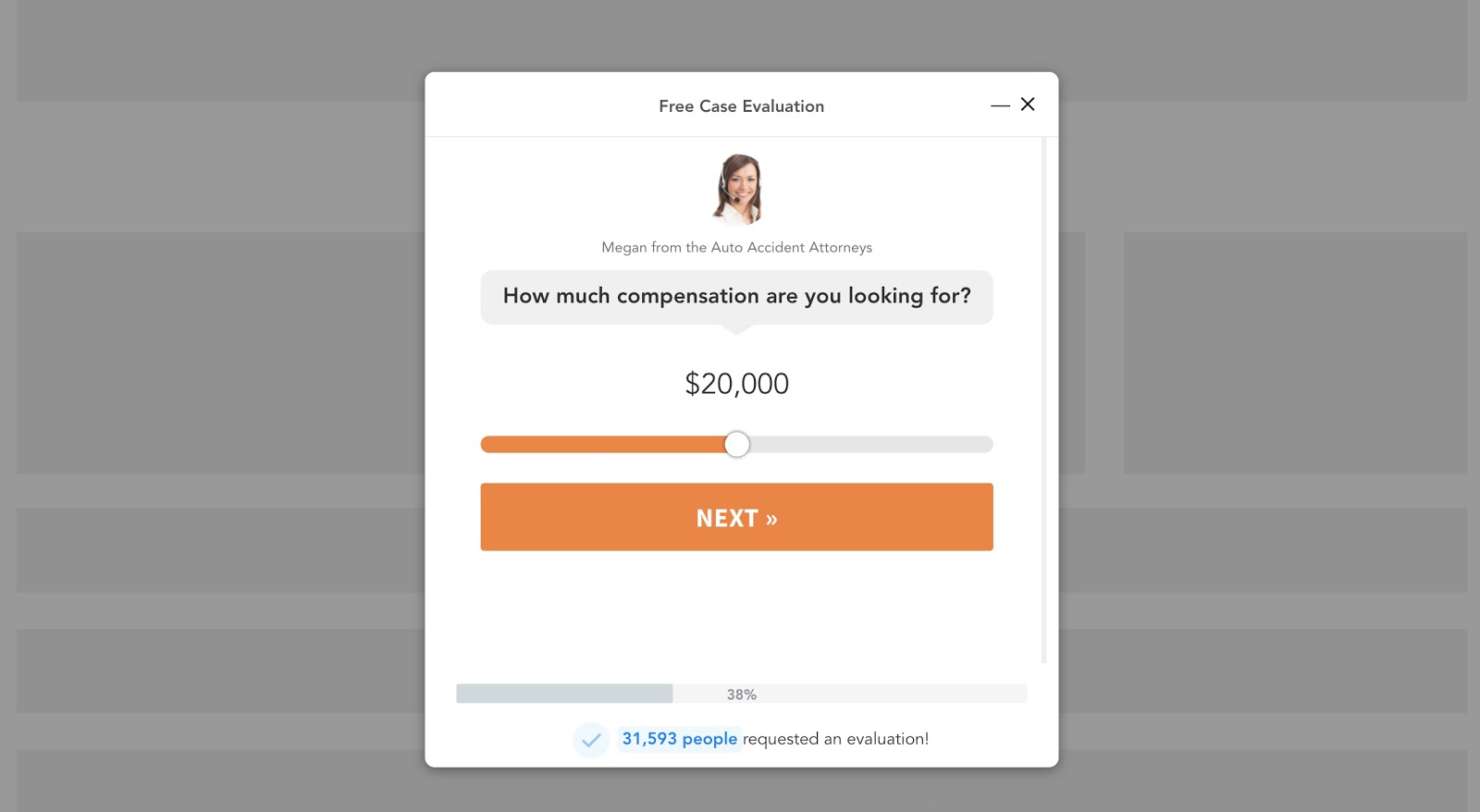
A slider like in the example above, is a great way to reduce form friction and decrease form abandonment. You can get this exact template here.
And here’s another example for a bankruptcy attorney. In this example, one of the questions is qualifying the prospect on how soon they are looking for an attorney.
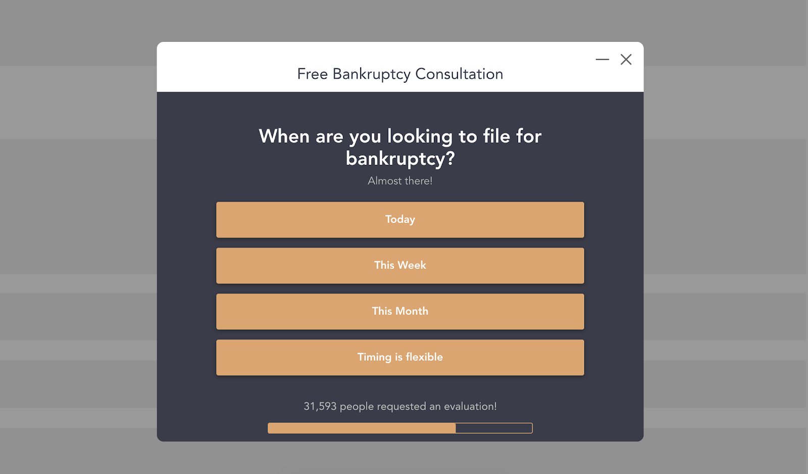
If you’re in the business of selling leads to attorneys, can you see how you could charge a premium for any leads that come in saying they are looking to file bankruptcy today?
What’s interesting is that only 40% of marketers are using interactive forms like this, so you’ll be one of the early marketers to take advantage of this trend.
These types of conversational forms reduce form friction, hold attention longer, and are more people-friendly. In the end, people enjoy filling out these forms instead of making it a boring old chore.
You can see some examples of multi-step forms in-action here.
3. Add Social Proof to Your Forms
When used the right way, social proof is an extremely effective way to increase conversions.

For those of us who are not familiar with the psychological concept of social proof at a deeper level, it’s similar to a concept called Crowded Restaurant Theory.
Imagine that you’re traveling through Italy and you see two virtually identical pizza restaurants next to each other.
Outside of one of the pizza restaurants is a line of twenty people waiting around the corner to get their slice. People are smiling, happy, and enjoying a good time. On the next one, it’s empty and the owner is behind the counter waiting for business.
What’s your initial reaction when you look at the empty restaurant?
Probably something like:
“What’s wrong with it?”
“Why are people not eating there?
Given that you’re not in a rush, you’ll probably want to be part of the in crowd and see what all the hype is about with the one that is crowded and booming.
So chances are, you’re going to go follow the crowd and go to the busy restaurant.
That’s the power of social proof.
And it can be used in your lead generation forms to reduce form abandonment as well.
For example…
When it comes to adding social proof on your actual form through a dynamic counter, this is something that is relatively new and is very effective.
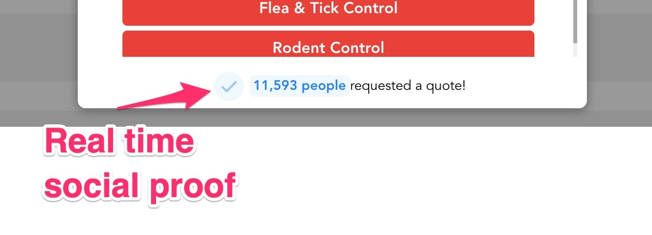 The checkmark indicates honest reporting and the true numbers of people who actually filled out the form before. Combined together, people will get the impression that this is a legitimate business that served many people before them.
The trust is earned and they’ll take the leap to complete the form and move towards making the purchase.
Social Proof (when done correctly) is a real thing and a very powerful part of marketing.
According to BrightLocal, 85% of consumers trust online reviews as much as personal recommendations and the team at UseProof built an entire business product around using social proof in marketing.
So, how are you using social proof on your forms? In the LeadForm above, it’s a pre-built feature that can be activated with a click of a button.
If you’re a LeadForms user, to add social proof to your form all you have to do is flip the Social Proof switch to the “on” position then add some details.
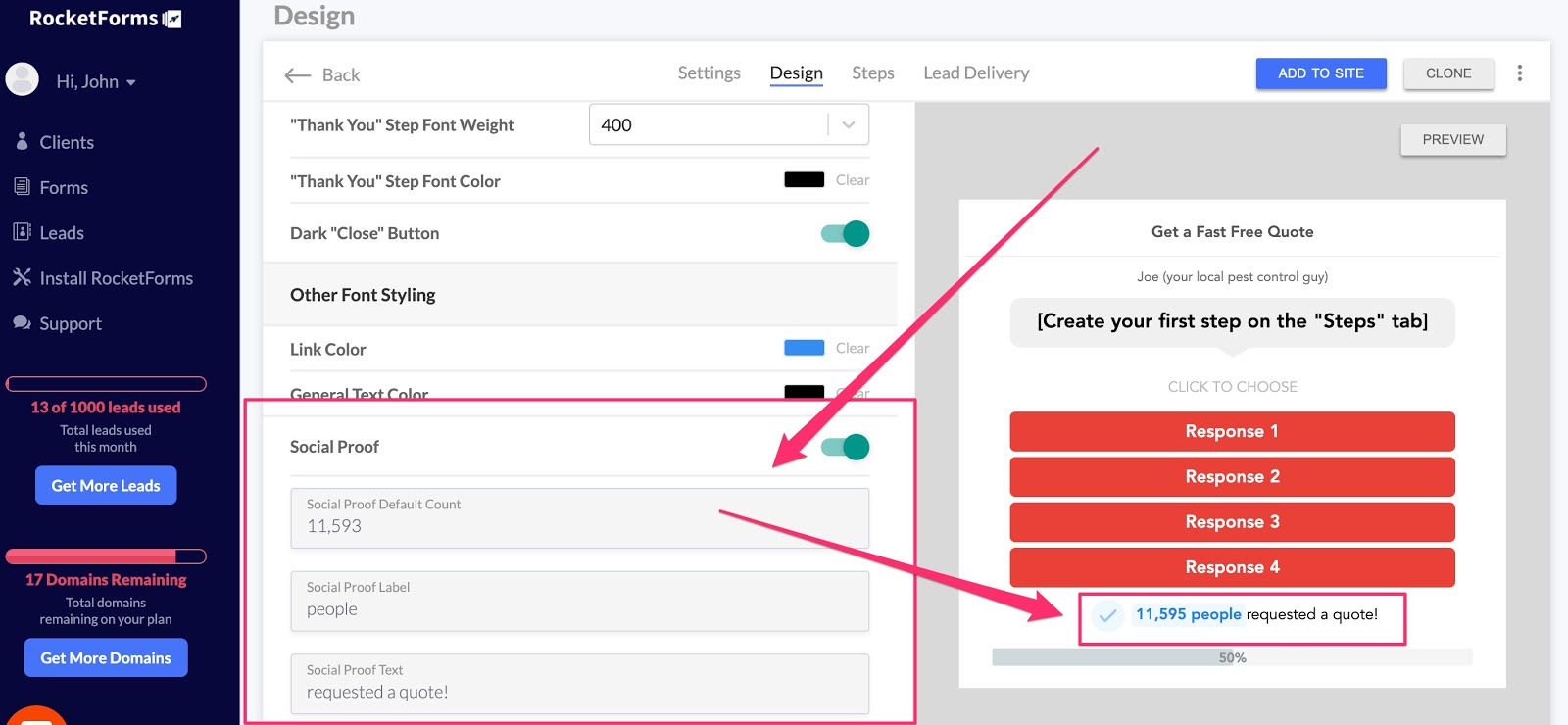
You can even seed your social proof to account for past users who may have taken action on your forms. The best part is that it’s authentic and increases with each form submission.
4. Use Personalization Throughout Your Forms
Personalization in marketing is powerful, but it’s also something many marketers just aren’t using yet.
According to Experian, you can see a 29% increase in open rates in your emails by adding personalization in the subject line and a 41% increase in CTRs for email marketing.
Now imagine adding personalization to your lead forms.
For example:
The form below asks, “Who is this quote for?”
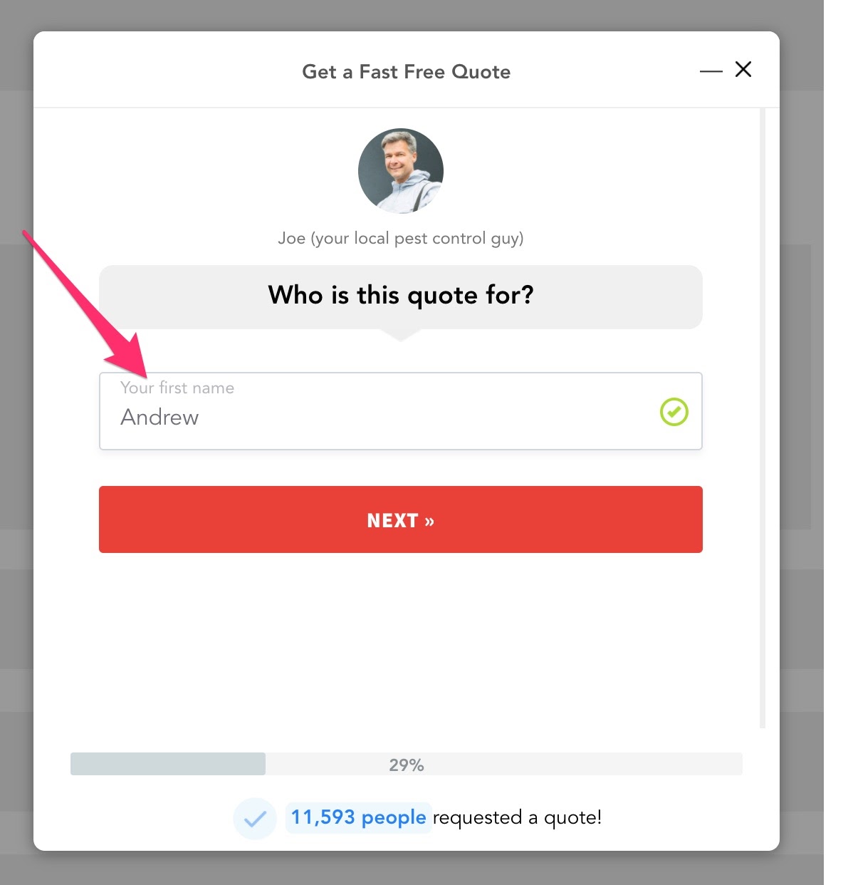
Next, the form captures the prospect’s name and then uses it on the very next step where it says, “Thanks (name)! Is this quote for your home or business.”
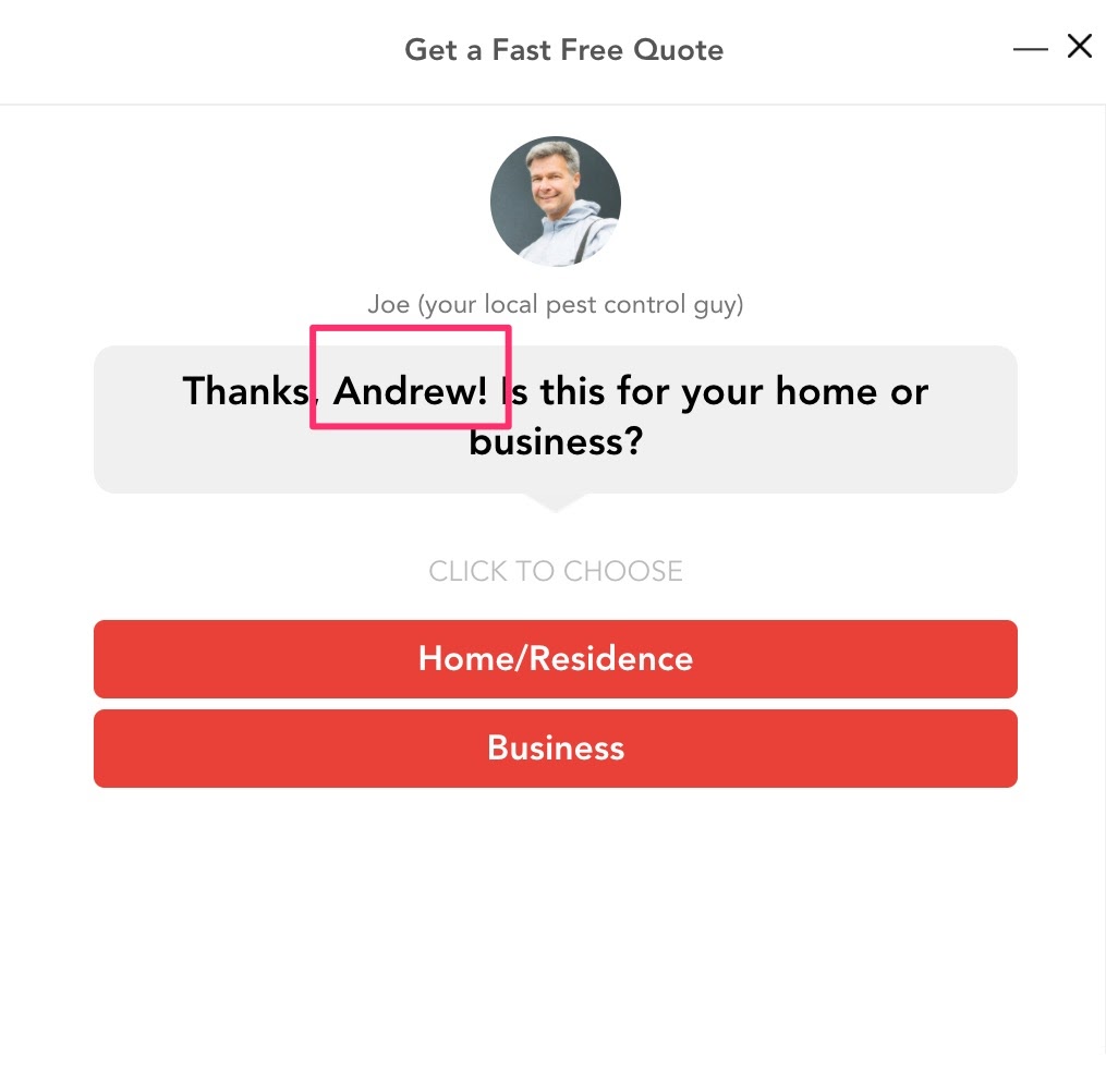 This subtle use of personalization not only goes a long way in making your prospect feel more comfortable with you, but it makes your forms more friendly and conversational than ever before.
Here’s another example of using form personalization to reduce form abandonment.
In this remodeling form, imagine that your prospect indicates that they would like to remodel their basement.
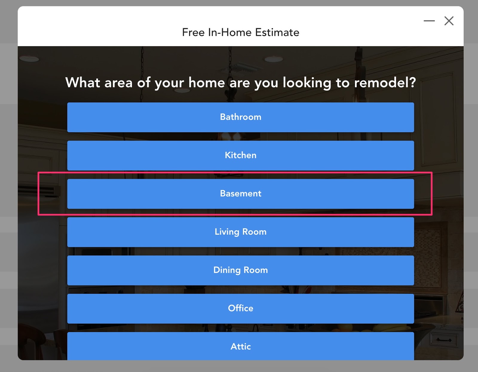
Notice in the image below, how the copy on the next step is personalized with the selection from the previous step: “How extensively do you want to remodel your basement.”
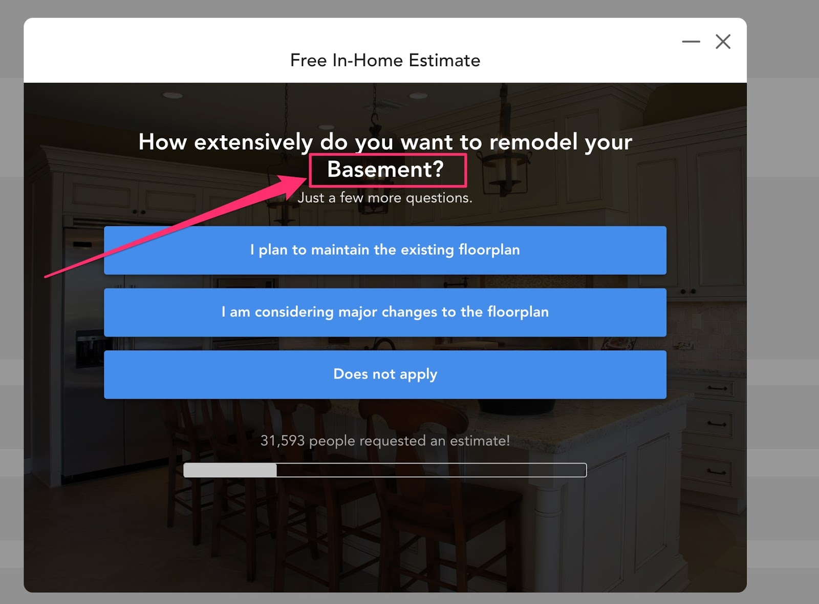
If the prospect had selected “kitchen” then the step would have automatically adjusted itself to be as relevant as possible.
You can see this form with personalization in-action here.
Whether it’s a name, city, or answer to a previous question – personalization really pulls the prospect through an experience that is memorable and meaningful to them
Now with that said, this is a pretty unique feature that most form tools do not come with out of the box. But luckily, we make this really easy to do inside of the LeadForms dashboard using a feature called Variables.
Simply grab any response, and paste the associated variable into the field, like in the example below and it will work like magic!
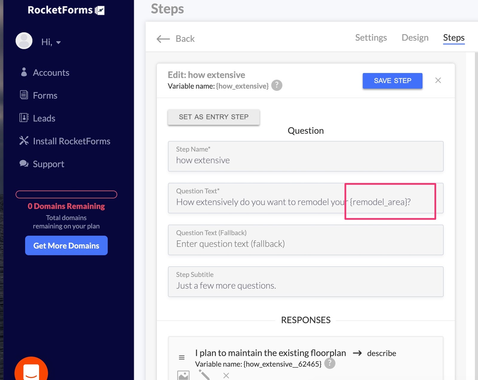
You can learn more about our Personalization Feature here.
5. Design Your Forms for the People Who Use Them
As a marketer, it is easy to get too comfortable with the idea of typing to a computer screen. Whether it’s the user interface of the Facebook ads control panel, the targeting you choose, the text you write, or the pictures you use – we grow accustomed to having a one-way-interaction with a computer.
But what about the human element?
It’s easy to forget that when you’re building your website, and especially your forms, you’re building them for the people like in the image below. Let’s just call them Bob and Lisa.

Imagine that this couple is sitting in their kitchen, planning to make major renovations to their home. They are about to spend tens of thousands of dollars for a job that they want done right and don’t want to take any risks with their investment.
This is who you are designing your forms for.
Bob and Lisa are part of the 66% of consumers who say that a frustrating experience on a website hurts their opinion of the overall brand. A poor experience on your website (and forms) lowers not only their opinion of the brand but the trust in doing business with you.
Therefore, it is your job to provide your prospects with a seamless experience that has no flaws in it whatsoever.
For example, one way that you can do this is to replace old fashioned drop downs with range sliders.
With range sliders, you can customize the size of the text and buttons to make the form less overwhelming, so your prospects can effortlessly go through the process.

When thinking about designing forms for people, here are some things to consider:
- Are you speaking to their true emotional pain points, needs, and desires?
- Is your lead form as frictionless as possible?
- Did you get a second set of eyes on your form to get honest feedback because you are too close to it? You might mean something in your own head but it may come out completely different when other people are reading it.
6. Add Your Image to Your Form to Decrease Online Form Abandonment
Building on the last point that you’re communicating with humans, you want to earn trust with the people going through the process of filling out your forms.
What better way to do this than to add your own picture?
Think of it this way…
Imagine that a pipe bursts in the middle of the night and I need to call a plumber.
The plumber who I end up choosing is going to be coming right into the middle of my home, in the middle of the day while my wife and son are home alone.
Therefore, before I even think about getting on the phone with someone, I want to make sure that I can trust them.
This is the EXACT SAME subconscious process that everyone goes through before they hire a contractor to come into their home.
With that in mind, don’t you think I might want to see the friendly face of the person who is going to show up to my house?
Or at least, the trustworthy owner of the company that operates in my area?
If you’re generating leads for a law firm, wouldn’t people want to see a professional attorney who is dressed in a suit, tie, and smiling instead of staring blankly at the screen with text?
So if you really want to decrease form abandonment WHILE building trust at the same time, then grab your phone, snap your best selfie and drop it on your form.

7. Avoid Technical Errors that Cause Confusion
If you see a significantly higher level of form abandonment than you’re expecting, it may be the result of technical errors that prevents the form from being submitted.
Back in the day, while using HTML and Javascript to build forms on my website, I was wondering why the conversion rate on my form was only about 1% despite having a very attractive lead magnet displayed for my audience.
After learning that many of my prospects had ad-blockers installed on their computers, I discovered that the line of Javascript that triggered the form didn’t work at all.
I lost out on tons of great leads before fixing the error, which caused my overall CPAs to increase.
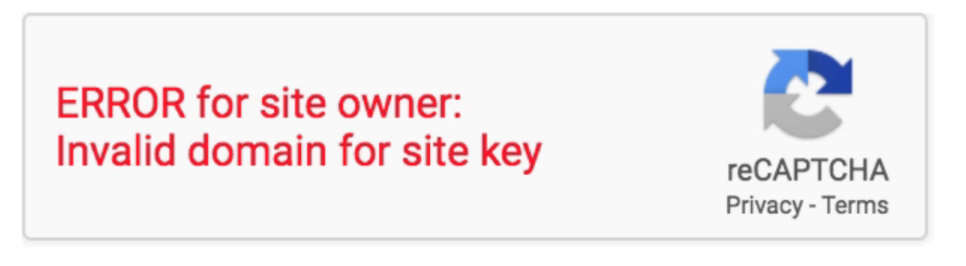
Common Technical Errors that Impact Online Form Abandonment:
- ReCaptcha Issues
- Browser Compatibility – Google Chrome has the highest form conversion rates while Internet Explorer is used by a lot of users in the older demographics and performs the worst.
- Poor Field Validation
- Mobile Responsiveness Issues – Have you tested how your form displays and functions for both desktop and mobile?
- Lack of Testing – Don’t just assume something will work when you put it up there the first time. Go through the process of testing out your form from multiple users, platforms, and devices. Be sure to check your error logs and conversion rates as a sign that something may be askew.
The likelihood of errors like this are much smaller when you use an online form builder compared to building and hosting your lead forms yourself.
8. Use Proper Form Validation to Decrease Abandonment
With the technical errors being fixed and your form working smoothly, the next thing you want to do is remove any obstacles that are a result of human error.
One of the biggest points of friction in a form is the way that validation is handled. For example, you don’t want your prospect to submit your form and see a bunch of validation errors like this.
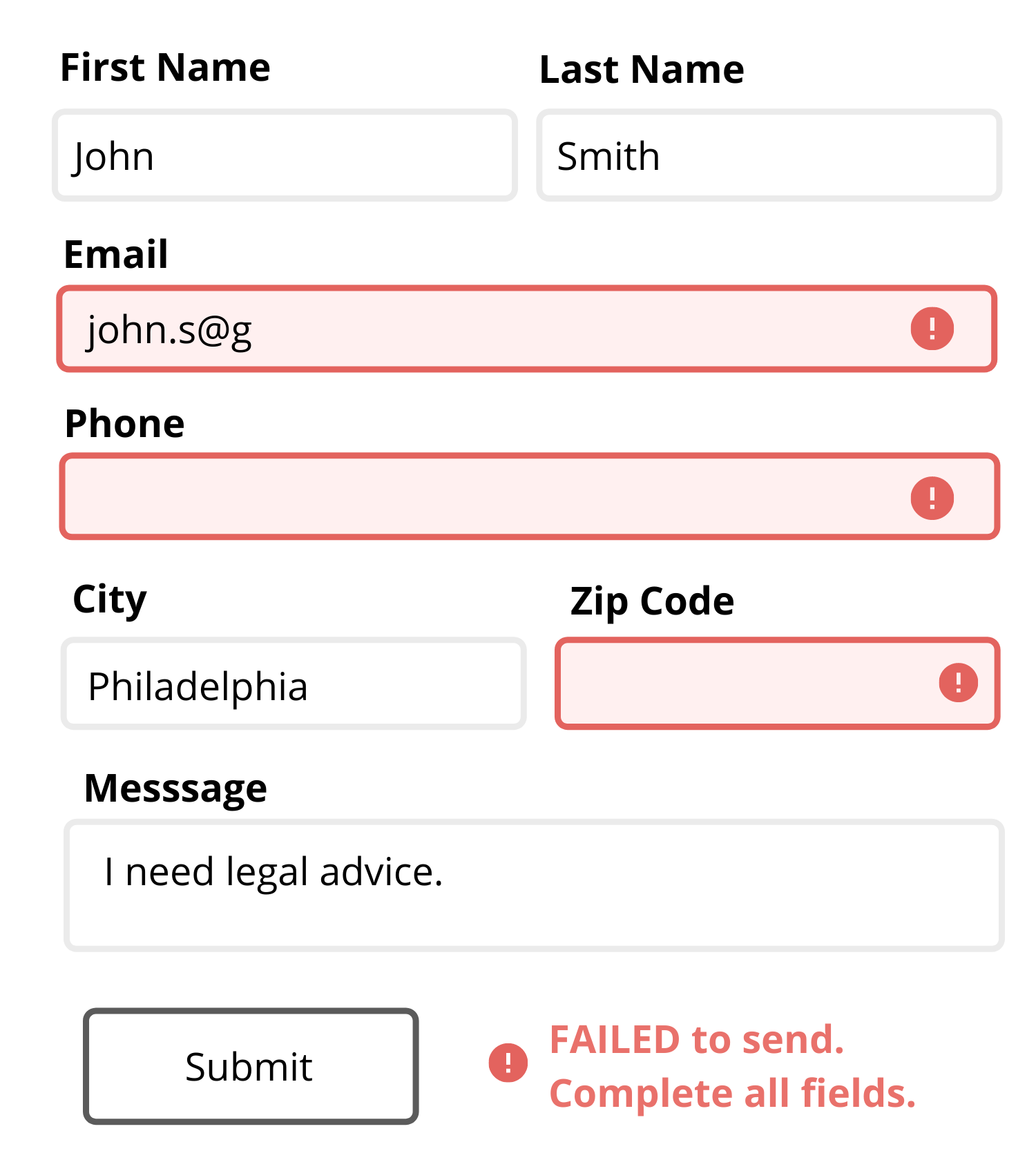
The validation errors above increase confusion.
And as we know, confusion is never a good thing.
Some marketers try to bypass this issue by not using validation in the first place, which only results in a bunch of unqualified leads.
You need some sort of validation in your form, but you also need to do it right.
When it comes to validation, you want your error message to occur in realtime, be direct, and inform that prospect about what exactly went wrong — don’t make them guess!
Take the following example where you need to collect the correct zip code:
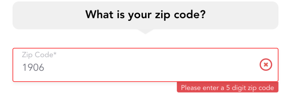
In this example, LeadForms instructs the prospect to correctly enter a 5-digit zip code before moving onto the next step.
It’s important to make sure your validation provides a detailed explanation on how to fix the error as opposed to a generic error message that tells the prospect to fix something and prevents the form from being submitted.
We’ve also found that it’s helpful to do the validation in real-time, before the visitor goes to submit the form.
9. Remind Your Prospect What They Are Getting By Completing Your Form
The average human attention span is rapidly declining due to an overload of information.

I remember when I first got involved in digital marketing, the standard instructions were that I had to capture the interest of the user within the first four seconds of communicating with them or else forget it… there’s no chance.
This ever-decreasing attention span carries over to lead forms.
When it comes to getting someone to submit your form for a quote, keep in mind that chances are the prospect you’re trying to get attention from will have at least five other tabs open on their browser comparing you to their competitor’s offer.
Always keep their eye on the prize.
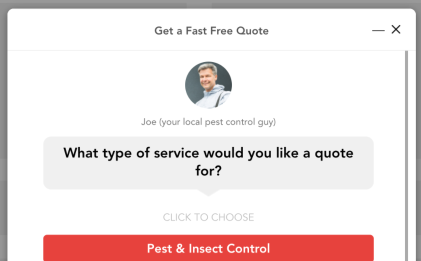
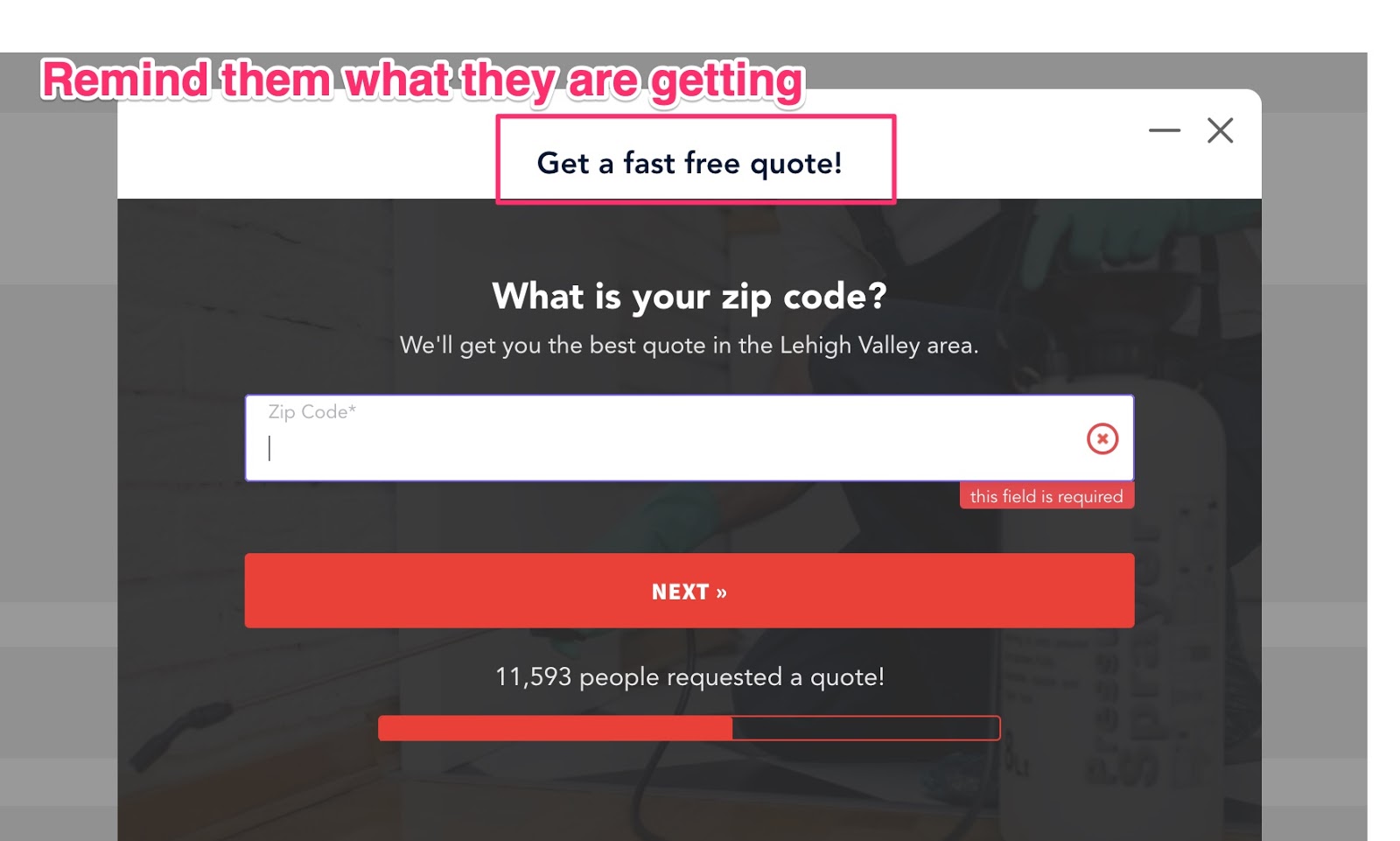
In the LeadForm example below, one way that we like to remind the prospect what they are getting is with a subtle headline message like:
“Get a Fast Free Quote”
“Get a Demo”
“Speak With Our Team”
“Save 15% Today”
For example:
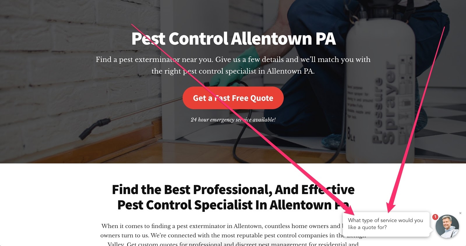
In the form below, the prospect is on step three of the lead generation form for a local pest control company. If they browse back and forth between the different tabs, they might forget where they are in the process, so a simple reminder such as “Get a Fast Free Quote” persists on each step as a subtle reminder about what they prospect is getting.
If you want to take things one step further, then you can even dynamically inject the headline of your PPC ad into the headline of your form to maximize relevance at the same time.
For example:
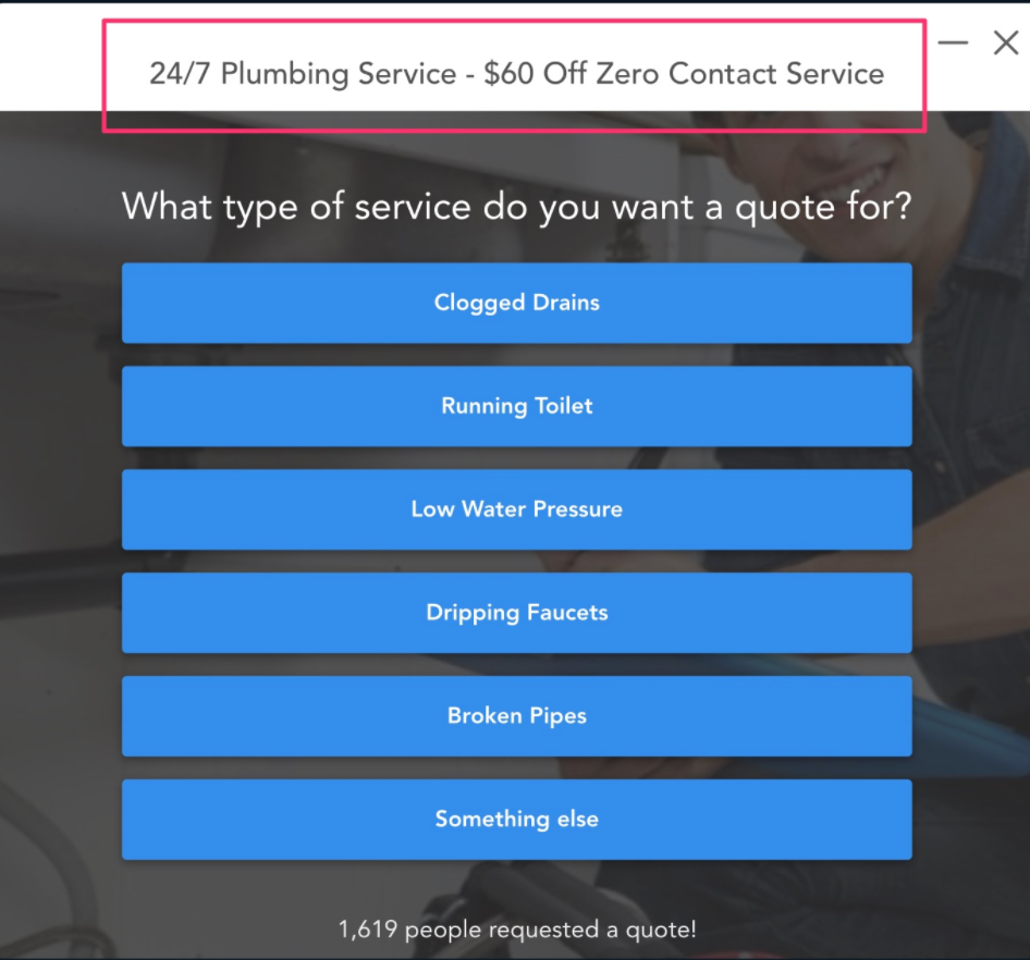
Imagine that you have a PPC ad with the headline, “24/7 Plubming Services — $60 Off Zero Contact Service”
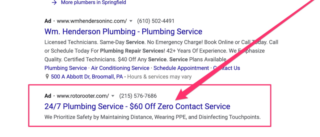
With LeadForms, you can carry this exact headline right into the top of your form to remind your prospect why they clicked on your ad to begin with.
What subtle (yet direct) reminders can you sprinkle throughout your forms to decrease the abandonment rate on your forms?
10. Track Form Abandonment Rate with A/B Testing
One of the best ways that you can reduce form abandonment and maximize conversions is to A/B test your form.
Through some very basic and easy A/B testing, you can quickly find out what works and what doesn’t work in your forms, then remove those friction points that are causing people to drop-off.
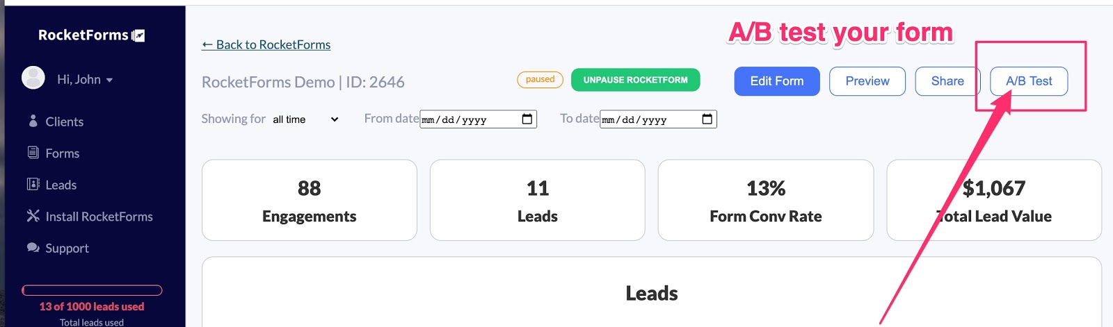
At LeadForms, we developed an A/B testing system that allows you to test all parts of your form: The headline, images, questions, steps, and so on — the possibilities are endless.
To spin up an A/B test inside of LeadForms, all you have to do is go to the LeadForm that you want to test and hit the A/B test button.
Next, make one key change to your variate form, then launch your A/B test.
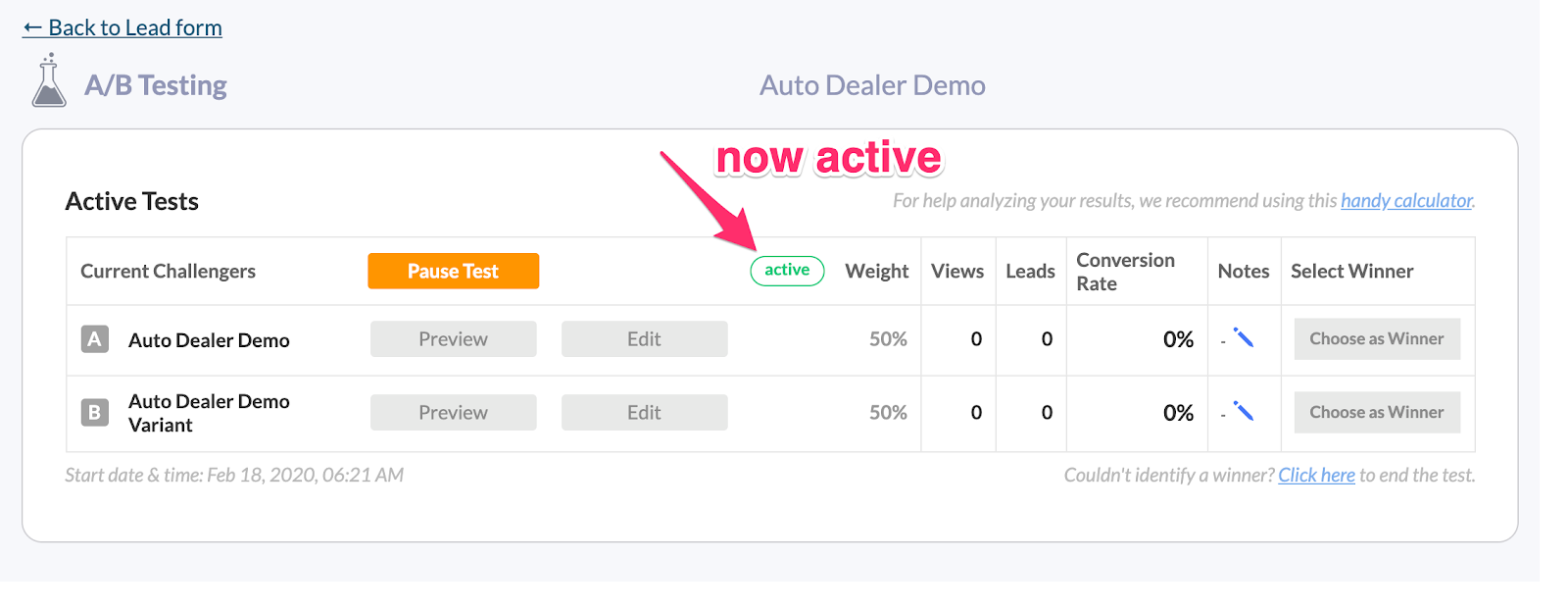
As people engage with your form, you’ll start getting valuable data to help you reduce form abandonment.
11. Make Your Forms More Accessible By Increasing Form Engagement
This point may have less to do with decreasing form abandonment, but it’s still a really key point to note.
One of the things that we learned at LeadForms is that if you can get more people to see your forms, you will get more leads…
Yes, it’s really that simple.
One simple way to do this is by making your forms more accessible across your website.
At LeadForms we accomplish this with a feature called the onsite message.
The onsite message is a friendly message that can live in the bottom right or left hand corner of the screen. When clicked, it opens your form.
This feature works the same sort of way that a chatbot works, but instead of opening a chatbot, it opens a conversational form. I’m not a fan of using chatbots for lead gen, here’s why.
Why does this work so well?
When thinking about optimizing UX for conversions, one of the key things that you can do is to reduce the number of clicks that it takes to access the call-to-action or the form.
With most sites it takes anywhere from 2-4 clicks to get to the site’s contact form. With the onsite message, the form is always just one-click away.
Keep in mind, you don’t have to use this type of feature to increase engagement. You can also increase form engagement with exit intent technology and even timed pop-ups.
What To Do Next:
By this point, hopefully you have learned a bunch of ways to optimize your forms to reduce form abandonment. And applying just one of these simple ideas to your lead forms can dramatically boost conversions.
If You’re Already a LeadForms Customer: I highly suggest applying some of the suggestions above. Try adding your image to your form, use social proof, and don’t forget about our A/B testing features! If you need help or advice, you can always reach out. We are always happy to help you optimize your forms for conversions.
If You’re Not a LeadForms Customer: If you’re not using LeadForms, then that’s okay, you can still take all of these ideas and apply them to your own forms. It may take some development work, but it will be worth it. Alternatively, you could try out LeadForms. Our forms come loaded with conversion boosting features that reduce form abandonment right out of the box and they work on any website. You can sign up for a free trial here.
For more examples of forms that reduce form abandonment, check out some of our conversational lead form templates here.